

Low-Code Tools for Enterprise Marketing: 4 Tools that Deliver Sophisticated Results


Key takeaways
- Enterprise-tested low-code tools can dramatically reduce website development time and costs - while still providing richness and depth
- Interactive data visualizations and multilingual capabilities no longer require custom development and can be launched in just hours
- Marketing teams can find more time and resources for strategic work by deploying and maintaining sophisticated experiences using low-code and no-code tools
- Hybrid architecture approaches (for example, WordPress + Webflow) maximize both power and agility
Marketing and communications teams are being asked to do more with less - tighter budgets, faster timelines, and more channels to manage - but face the same expectation for delivering website experiences that compete at the cutting edge.
Sophistication, however, doesn't always mean building everything from scratch. Sometimes it means knowing which tools to combine thoughtfully, freeing up resources to focus on the strategic work that truly differentiates your organization.
We’ve seen this firsthand across a number of industries. Consider that 75% of large enterprises are expected to be using at least four low-code development tools by the end of 2025 (Gartner), and 70% of new applications will use low-code or no-code technologies, up from less than 25% in 2020 (Gartner).
We've built a digital agency predicated on the belief that every organization has unique opportunities, unique challenges, and unique stories to tell - and off-the-shelf solutions rarely meet these needs. Using low-code tools isn’t about cutting corners, however: it’s about doing more with less.
So here are four tools that have fundamentally changed how we deliver website features, letting teams punch above their weight while maintaining the thoughtful, tailored approach that complex organizations require.
We chose these tools for this overview because they offer quick on-ramps to adding strategic functionality to websites without sacrificing depth, and can go a long way towards executing against four of our favorite ways to make websites more useful, delivering interactivity that gives them visit value even in a time of zero-click searching.
Weglot:
Multilingual websites are no longer a nightmare
Building multilingual websites used to mean complex database structures, translation workflow management, and ongoing technical maintenance. These projects can be among the messiest web development projects you’ll encounter, because they generate tons of edge cases and exceptions - not to mention complicated governance schemes.
Weglot - a low-code website translation platform that we've used for a number of highly-complex WordPress sites - changes this equation entirely. Sites can become multilingual in hours, not months. More importantly, content teams can edit translations directly, making real-time adjustments for cultural nuance without waiting for developer cycles.
The real value isn't speed, it's strategic flexibility. Need to test an international market, serve diverse local communities, or meet accessibility requirements? You can now do that without massive upfront investment. Instead of "we'll think about Spanish content in phase two," teams can launch sites with bilingual or multilingual content on Day One and learn from real user behavior.
Weglot handles the sophisticated technical requirements (automatic detection, SEO optimization, subdomain routing) that would typically require extensive custom development. This frees up resources to focus on the strategic questions: What markets are worth expanding into? What content resonates with different audiences? How do cultural differences affect user experience?
Weglot examples
Many of our clients' enterprise website needs include communicating with multiple audiences, including in different locations and in different languages. For large websites, this used to be a challenge insurmountable for all but the most resourced organizations. We've fallen in love with using Weglot to bring multilingual content within reach for many marketing teams.
The Chinese American Service League, one of Chicago's biggest nonprofits, serves local populations - including multi-generational and multi-cultural families - that speak many languages, including English, Mandarin, and Spanish. The new website we built for CASL offers, for the first time, the entire site experience in English as well as in Simplified Chinese and Spanish:

Healthy Families America, which provides in-home visiting support free of charge to parents, uses Weglot on their new WP Engine-powered WordPress site. Even the interactive calculator, which helps potential affiliates understand the costs of deploying their evidence-based early childhood home visiting model in their communities:

Webflow:
Rapid deployment for brand-consistent experiences
For years, WordPress has been our platform of choice for complex, content-heavy websites. The enterprise-grade security, extensibility, and content management capabilities of a well-built WordPress ecosystem remain unmatched for sophisticated organizational needs.
But not every project needs that level of complexity.
Webflow has become our go-to solution for rapidly spinning up brand-consistent microsites, landing pages, and campaign assets. Think hybrid architecture: WordPress for the main corporate presence, Webflow for everything that needs to be fast, focused, and flexible.
Being able to launch a campaign landing page in weeks or days rather than months changes how teams can respond to opportunities. Marketing teams can maintain and iterate on these experiences without constantly pulling development resources away from larger projects.
Many enterprises are turning toward low-code/no-code tools for their ability to reduce strain on IT resources and increase speed-to-market. Webflow exemplifies this perfectly: sophisticated design capabilities with the agility to execute campaigns and test ideas quickly.
Webflow examples:
While we use WordPress for our most complex websites, Webflow gives us the ability to dramatically speed time to launch and lower development costs through it's low-code website development features. In some cases, Webflow is now used in concert with WordPress at the same organization: WordPress (via WP Engine) doing the heavy lifting for experiences requiring lots of server-side code or custom integrations, and Webflow used for rapidly launching campaign websites and microsites.
Clean Power Institute, an American Clean Power Association affiliate anda partnership comprised of leading clean energy companies, is focused on building the renewable energy workforce. Despite the fact that it is built using Webflow (designed and developed in just weeks!) - unlike its bigger sibling, the WP Engine-powered cleanpower.org - it nonetheless leverages rich functionality like background video, an embedded wind tech career quiz, a library of career stories, and donation widgets:

UnidosUS is the largest civil rights organization defending, protecting, and advancing the rights of Latinos in the United States. Like the American Clean Power Association, its sprawling and constantly changing website is built on WordPress and hosted on a dedicated WP Engine server. However, when we needed to spin up a new affiliate portal to extend Unidos' ability to help affiliates react to Trump Administration policies, we turned to Webflow which enabled us to build a secure, authenticated experience that leveraged data from multiple sources and get it live in less than a month:

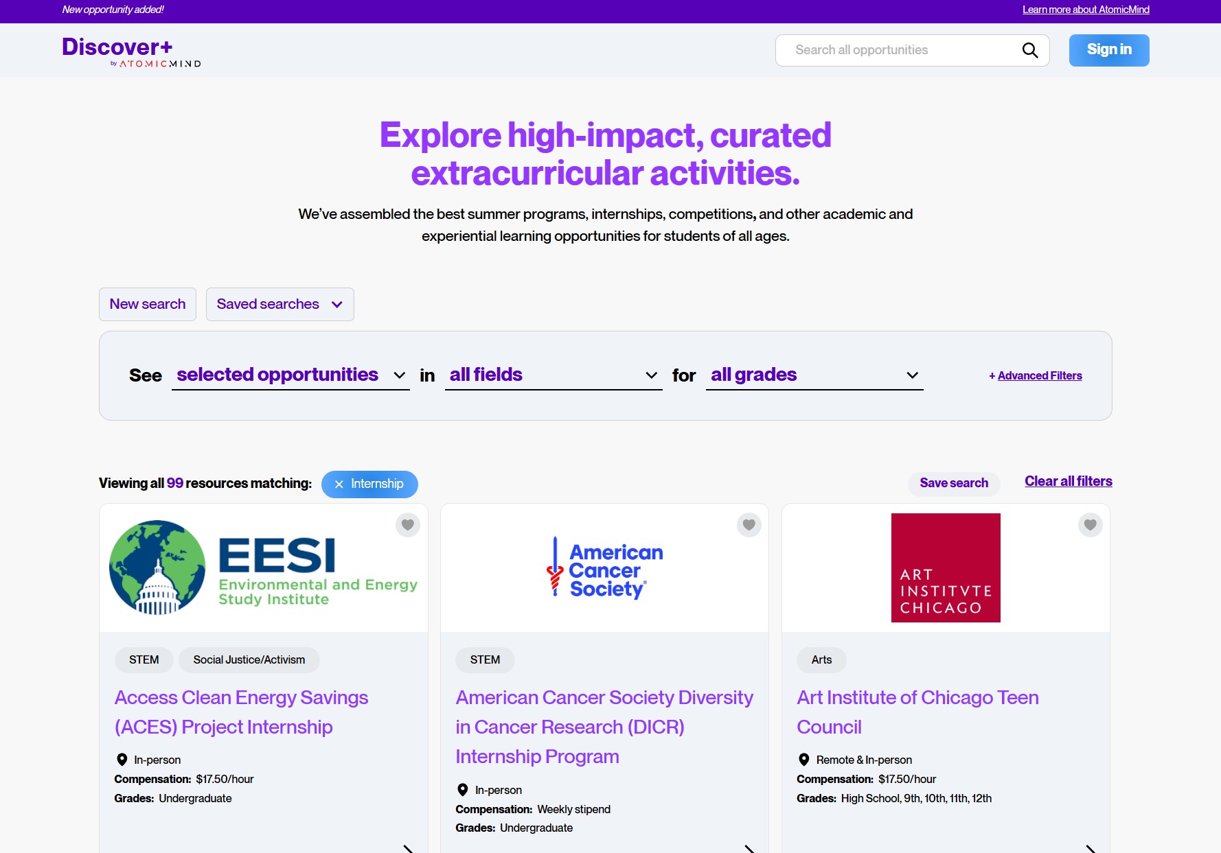
As zero-click searches rise with the advent of AI answer engines, clients are opting to build web-based tools alongside their websites, because the value inherent in these isn't as easily replaceable. Our client Atomic Mind, which helps prepare high school students for college and beyond, envisioned a huge and constantly-updated, searchable, filterable list of internships, scholarships, summer programs, competitions, and more. Discover+, was built on Webflow using other no-code and low-code tools like Airtable and Memberstack and now showcases nearly a thousand high-impact extracurricular activities for students, becoming a growing revenue source on its own to support Atomic's important work:
Flourish:
Interactive data visualization without the development overhead
Market reports, impact assessments, and educational storytelling can often make or break stakeholder engagement. Turning spreadsheets of data into compelling, interactive visualizations used to mean significant development time and budget.
Flourish - a data visualization platform for creating interactive charts, maps, and timelines - enables almost anyone to tell stories with data. A huge library of visualization types - from animated bar charts and interactive maps to complex network diagrams - can be populated directly from spreadsheets and styled to match brand guidelines.
If you're regularly produce data-heavy content, this is transformational: instead of static charts that lose impact over time, you can create interactive experiences that let users explore the data themselves. A renewable energy developer can show project timelines that users can filter by region or technology type. A nonprofit can present impact metrics that stakeholders can drill down into by program or demographic. An industry association can tie growth to hard-won policies in animated bar charts seamlessly woven through annual reports.
The biggest advantage isn't just in the visual appeal (although that matters for engagement): it's that content teams can iterate and update these visualizations themselves as new data becomes available.
Flourish examples
DT clients are turning to Flourish's rapidly-deployable data interactives to underscore their thought leadership positions by anchoring their storytelling in real numbers.
The American Clean Power Association's 2024 Market Report: Clean Energy Powers America uses a number of Flourish's built-in visualization types to illuminate renewable energy market trends, such as renewable energy capacity installed by Republican vs. Democratic-led districts:

EnergyStorage.org's page on the economic benefits of energy storage includes simple, interactive bar and line graphs that encourage users to understand the real impact of B.E.S.S. technologies by comparing cumulative capacity with growth and projected growth, all without leaving the webpage, and all seamlessly styled to match the brand:

The Chinese American Service League's annual impact report leverages Flourish's various interactive templates to bring its numbers to life, for example the pie chart below that shows breaks down its funding sources and allows users to hide certain categories to simplify the visualization:

Mapbox:
Custom interactive maps in half the time
Geographic data tells stories that spreadsheets simply can't. But custom interactive maps have traditionally required lots of development time - the kind of project that could easily push budgets beyond what many content initiatives can support.
Mapbox provides enterprise-grade mapping capabilities with a user-friendly interface that dramatically reduces both development time and complexity. Whether it's showing renewable energy projects across multiple states, academic performance data across school districts, or infrastructure development timelines, teams can create sophisticated interactive maps in days rather than weeks.
These aren't simple pin-on-a-map solutions: they're custom-styled, data-rich experiences that can handle complex datasets and provide meaningful interactivity. Users can filter, zoom, and explore data in ways that static maps or even basic web maps simply can't support. (Mapbox APIs and SDKs aren't just for web - they're also used in some of the most popular consumer apps in the world, and in the navigation featured in millions of cars).
For organizations that need to communicate geographic or location-based information regularly, Mapbox fundamentally changes the cost-benefit equation. Teams can reduce the time they spend on technical implementation and instead focus their energy on the strategic questions that will set the work product apart.
Mapbox examples
Below are three examples of how we've used Mapbox to add interactive geo-visualizations to our clients' websites.
The footer of Faulconer Construction's website features a zoomable map with pins for locations where there team has a presence. This adds a moment of surprise and delight at a point in the web experience where users may expect a drier, more utilitarian look:

Clearway Energy Group's renewable energy project map doesn't just let users explore the hundreds of operating and development projects in their portfolio, but filter them by technology and stage, highlight areas of active development, and see case studies and project info easily as well:

A citizen engagement tool designed to help parents in Puerto Rico understand the performance of their childrens' schools, ABRE Tu Escuela includes an interactive visualization built on Mapbox that has helped policymakers and educators identify trends and surface areas needing improvement or new approaches:

Less can be more
The best experiences often feel effortless to users, which usually means the complexity is hidden, not eliminated. Low-code platforms can reduce development time by 90% (Red Hat), but the real value is in what teams do with that saved time and budget.
Smart organizations aren't using these tools to do the same work faster, they're using them to do different work. More strategic work. More user-focused work.
The future belongs to teams that can balance thoughtful strategy with tactical agility. Tools that remove technical barriers without removing the need for good thinking. Organizations that can punch above their weight not because they have bigger budgets, but because they make smarter choices about where to spend their energy.
Frequently asked questions
Q: Can low-code tools help enterprise marketing teams specifically?
A: Yes: low-code tools can be used to create sophisticated campaigns and add rich interactivity without constantly requiring developer resources, reducing both costs and time-to-market while maintaining enterprise-grade security and functionality.
Q: What's the difference between low-code and no-code for marketing teams?
A: Low-code platforms offer some customization flexibility for technical team members, while no-code solutions rely entirely on visual interfaces. Both reduce the need for traditional development cycles, and both can extend marketing teams' ability to respond to business needs rapidly.
Q: How can I calculate ROI on low-code marketing tools?
A: When evaluating low-code platforms, consider developer time savings (typically 50-90% reduction (Vev) (Red Hat)), faster campaign deployment, increased marketing team autonomy, and the opportunity cost of delayed initiatives.
Q: What should enterprise marketing leaders look for in low-code tools?
A: Prioritize enterprise-grade security, integration capabilities with existing systems, scalability, and team collaboration features. This all assumes you’ve found tools that align with your specific content and user needs.
How to begin using low-code tools:
Start by auditing which frequent content updates currently require developer intervention... those are your prime candidates for low-code solutions. If you want help leveling up your web presence, please feel free to reach out to us.